Dashboard for Basic Financial Data Analysis
Introduction
In this post, we will set up a basic view in Coda, which will serve as the starting point for creating a more comprehensive financial and efficiency analytics system for our company and specialists.
Why do I believe that such a dashboard is an absolute necessity?
A results analysis dashboard is crucial because it allows a company to quickly understand its overall financial health and operational efficiency. It includes basic indicators such as revenues, employee costs, and other expenses, which are essential for assessing profitability.
Income and margin calculations provide valuable insights into how much profit the company generates at different stages, which in turn enables informed decisions regarding cost optimization, improving efficiency, and boosting profitability.
From a management perspective, such a dashboard becomes the foundation for more advanced financial and performance analyses that may include trend monitoring, forecasting, and identifying areas for improvement.
Planning the Dashboard:
To create the absolute basics, we need one document in Coda.io with a chart for analysis and another document with a table for storing the data on which the charts will be based.
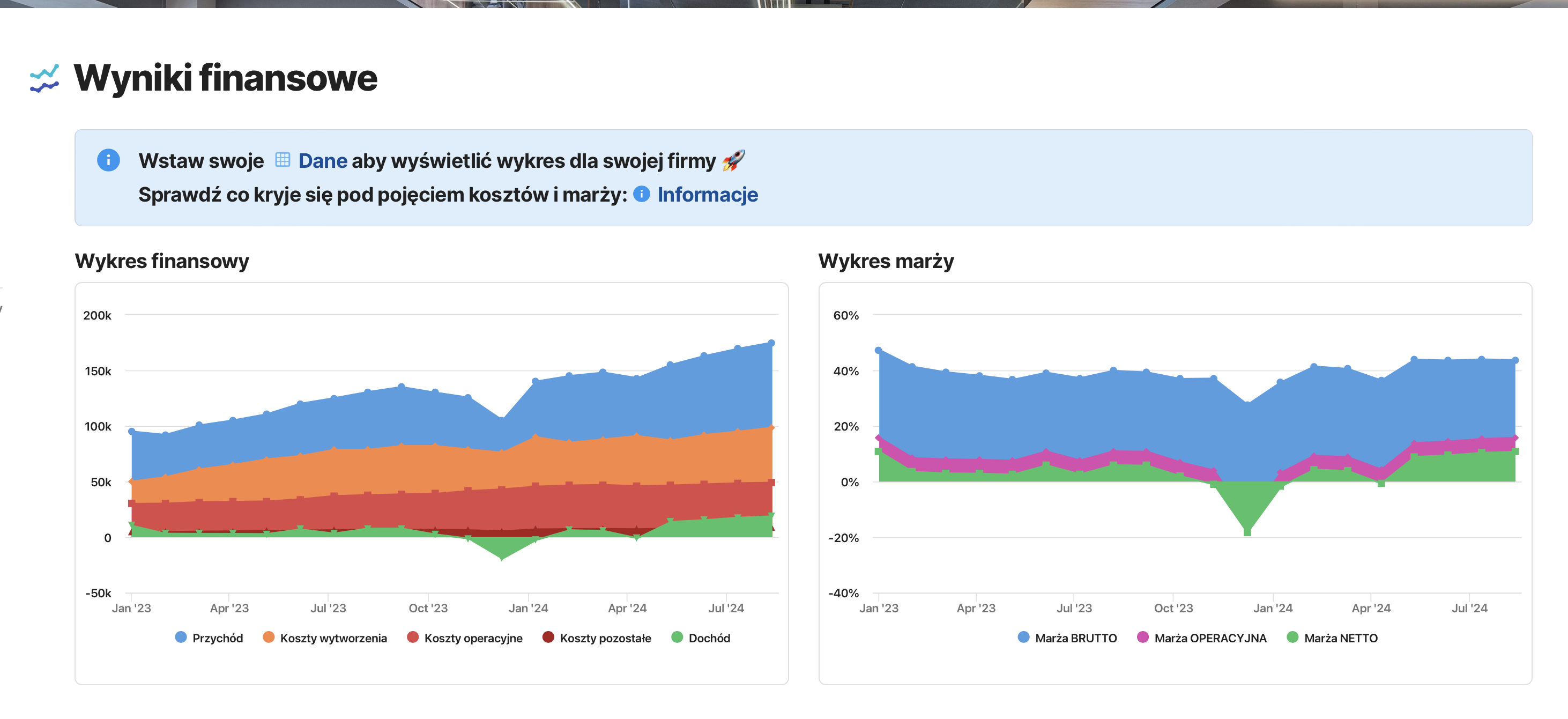
In the document with charts, I want to have the ability to clearly analyze:
- Revenue
- Production costs
- Operational costs
- Other expenses
- Income
- Margins
All presented in a way that shows trends over the months.
In the document with tables, we will need to create a table to store all this data.
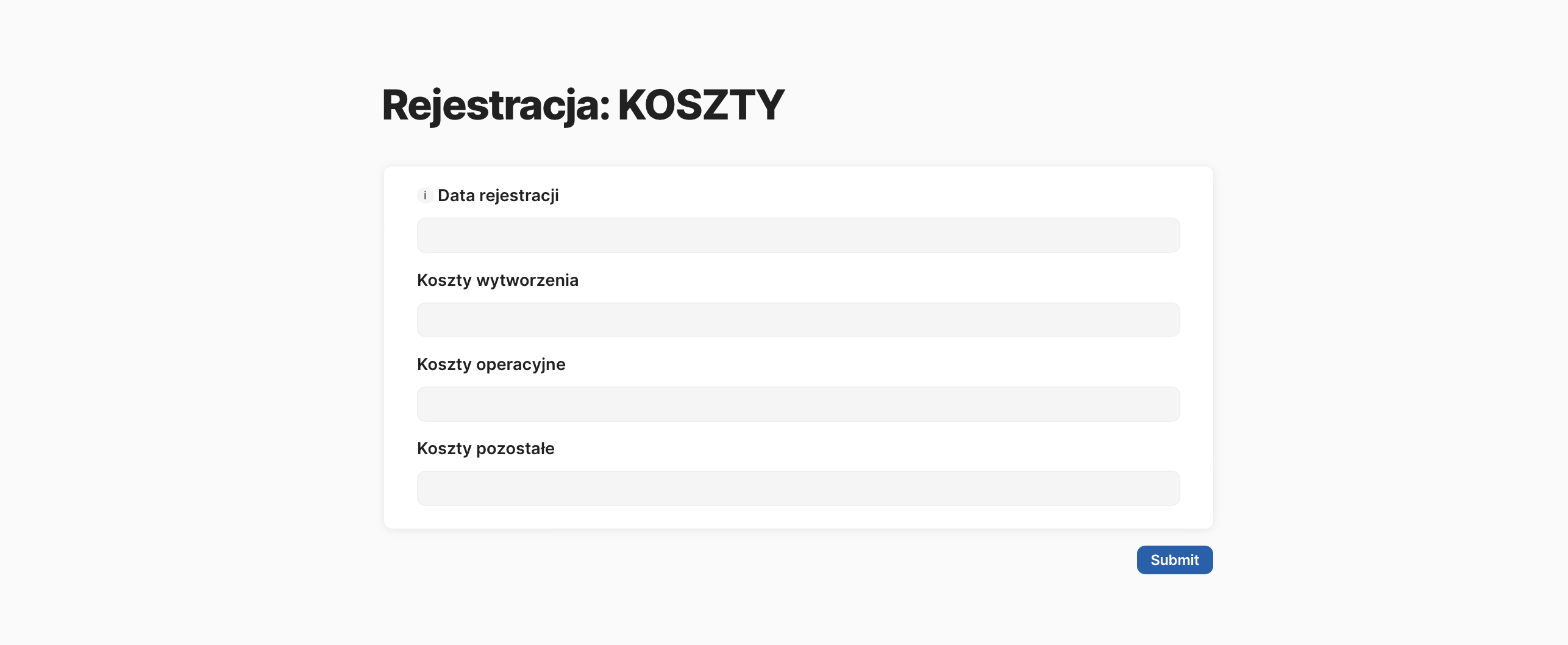
Creating the Data Table
I start by defining the number of columns and their types. We don’t have data yet, but we already have a structure for it.
- Month – type: Date
- Revenue, Costs, Income – type: Number
- Margin – type: Number – Percentage
Not all columns will be filled in manually: income and margins will be automatically calculated based on the data in the Revenue and Costs columns.
Inserting Formulas in Automatically Filled Columns
For Income, it will be Revenue minus all costs.
For Gross Margin, the calculation will be Revenue minus team costs, divided by Revenue.
For Operating Margin, the formula looks like this: Revenue minus production and operational costs.
For Net Margin, we subtract all other costs and divide by Revenue.
Filling the Table with Data
We only enter data in the first three columns: Revenue, team costs, and company costs.
At this point, I add table formatting to easily see the trend of changes in the numbers in each column.
In the table view, I hide the Income and Margin data at the end, as no one will be entering this data in this view.
Creating Charts
Using Coda.io’s functionality, I prepare an alternative view of the data table and show how the generated revenue is being “eaten up” by costs.
Next to it, I insert a margin chart for the entire company.
Each chart uses the data placed in the main table.
In the next post, we will analyze the created charts together, but for now, check out the created document via the link, and fill it with your data to see your results.
Try performing an analysis of these basic charts on your own.
Check out the discussed document [here] and sign up for a free Coda.io account.